Portfolio Analysis: corrplot, charts and graphs
This post is a follow-up to a previous post where we created data tables with values and metrics from tickers in a portfolio. The same data frames will be used here (see previous post for code). In this post, we will calculate portfolio returns and create charts and graphs.
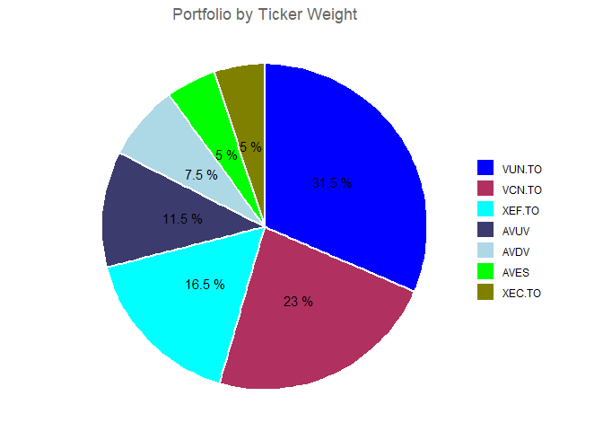
Create a pie chart of the portfolio
We will use ggplot2 to create a pie chart. In the previous thread, we used the tidyverse package which contains ggplot2, dyplr, and other useful packages. Let’s load it here again.
1
2
3
4
5
6
7
8
9
10
11
12
13
14
15
16
17
18
19
  library(tidyverse) #or ggplot2

# Convert Ticker to a factor with levels ordered by Weight. This is for the ordering of the slices in the chart.
# `financial_data` was created in the previous post
  financial_data$Ticker <- factor(financial_data$Ticker, levels =
  financial_data$Ticker[order(financial_data$Weight, decreasing =  FALSE)])

# Create the pie chart.
ggplot(financial_data, aes(x = "", y = Weight, fill = Ticker)) +
  geom_bar(stat = "identity", width = 1, linewidth = 1, colour="white") +
  coord_polar("y") + #transform the geom_bar (stacked bar) into a circle (pie)
  geom_text(aes(label = paste(round(Weight / sum(Weight) * 100, 1), "%")), # text labels
            position = position_stack(vjust = 0.5), color="black") +
  labs(x = NULL, y = NULL, fill = NULL,
         title = "Portfolio by Ticker Weight") +
    guides(fill = guide_legend(reverse = TRUE)) + #reverses legend
    scale_fill_manual(values = c("#808000","green","lightblue", "#3b3b6d", "cyan", "maroon", "blue")) +
    theme_void() +
    theme(plot.title = element_text(hjust = 0.5, color = "#666666")) #color the chart
Calculating stock returns1
The quantmod package will be used to pull stock data from Yahoo Finance and set up a function to get the monthly returns.
1
2
3
4
5
6
7
8
9
10
11
12
13
14
15
16
17
18
19
20
21
22
library(quantmod)

#Function to get monthly returs. It takes two arguments.
monthly_returns <- function(ticker, base_year)
{
  # Obtain stock price data from Yahoo! Finance
  stock <- getSymbols(ticker, src = "yahoo", auto.assign = FALSE)
  # Remove missing values
  stock <- na.omit(stock)
  # Keep only adjusted closing stock prices
  stock <- stock[, 6]

  # Confine our observations to begin at the base year and end at the last available trading day
  horizon <- paste0(as.character(base_year), "/", as.character(Sys.Date()))
  stock <- stock[horizon]

  # Calculate monthly arithmetic returns
  data <- periodReturn(stock, period = "monthly", type = "arithmetic")

  # Assign to the global environment to be accessible
  assign(ticker, data, envir = .GlobalEnv)
}
We now call our function for each stock in the portfolio.
1
2
3
4
5
6
7
8
9
10
11
12
13
14
15
16
# Call our function for each stock. I am using 2021 as it is the starting year
# for some tickers in the portfolio.
monthly_returns("VUN.TO", 2021)
monthly_returns("VCN.TO", 2021)
monthly_returns("XEF.TO", 2021)
monthly_returns("AVUV", 2021)
monthly_returns("AVDV", 2021)
monthly_returns("XEC.TO", 2021)
monthly_returns("AVES", 2021)

# Merge all the data and rename columns
returns <- merge.xts(VUN.TO, VCN.TO, XEF.TO, AVUV, AVDV, XEC.TO, AVES)
colnames(returns) <- c("VUN.TO", "VCN.TO", "XEF.TO", "AVUV", "AVDV", "XEC.TO", "AVES")

# Print last 5 rows of the data, rounded to 4 decimal places
round(tail(returns, n = 5), 4)
| VUN.TO | VCN.TO | XEF.TO | AVUV | AVDV | XEC.TO | AVES | |
|---|---|---|---|---|---|---|---|
| 2023-08-31 | 0.0066 | -0.0124 | -0.0139 | -0.0361 | -0.0284 | -0.0370 | -0.0538 |
| 2023-09-29 | -0.0438 | -0.0320 | -0.0305 | -0.0355 | -0.0225 | -0.0239 | -0.0125 |
| 2023-10-31 | -0.0064 | -0.0310 | -0.0136 | -0.0502 | -0.0334 | -0.0165 | -0.0394 |
| 2023-11-30 | 0.0690 | 0.0741 | 0.0603 | 0.0854 | 0.0663 | 0.0572 | 0.0836 |
| 2023-12-01 | 0.0041 | 0.0104 | 0.0059 | 0.0311 | 0.0129 | 0.0000 | 0.0083 |
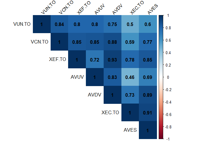
Analyzing portfolio composition.
Using the corrplot, a specialized package designed for visualizing correlation matrices, we can quickly grasp the correlation between the stocks in the portfolio. Since they are all equities, you expect a positive correlation. The AV tickers (like AVUV) overlap with the other funds, with an added tilt towards (small cap) value. In the case of this portfolio, we expect a strong correlation between these groups:
- VUN.TO & AVUV
- XEF.TO & AVDV
- XEC.TO & AVES
1
2
3
4
5
6
library(corrplot)
returns_corr <- na.omit(returns) # omit "NA" values from returns, if any
corr_matrix <- cor(returns_corr) # create a corr data table
#Display only the upper triangle of the matrix
corrplot(corr_matrix, method = "color", type = "upper",
         addCoef.col = "black", tl.col = "black", tl.srt = 45)
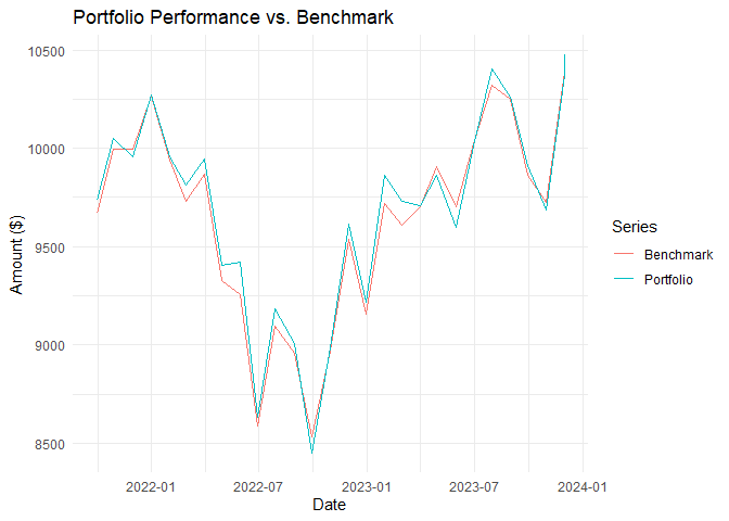
Making a graph of the portfolio returns compared to a benchmark
We are now loading the PerformanceAnalytics package to calculate the portfolio’s return. Once again we will be using ggplot2 to make a chart with two lines: the returns in our portfolio and the returns of a benchmark stock. In this case, the chosen benchmark is the ticker VEQT.TO, an all-in-one ETF consisting of 100% equities with international diversification. The initial investment will be of 10,000.
1
2
3
4
5
6
7
8
9
10
11
12
13
14
15
16
17
18
19
20
21
22
23
24
25
26
27
28
library(PerformanceAnalytics)

# Calculate benchmark returns and add to a dataframe
monthly_returns("VEQT.TO", 2021)
# Merge to a new dataframe "returns_bm" the data and rename columns
returns_bm <- merge.xts(returns, VEQT.TO)
returns_bm <- na.omit(returns_bm) #Omit 'NA' values
colnames(returns_bm) <- c("VUN.TO", "VCN.TO", "XEF.TO", "AVUV", "AVDV", "XEC.TO", "AVES", "VEQT.TO") # Rename columns


initial_investment <- 10000

# Only select first seven columns to isolate our individual stock data
portfolio_returns <- Return.portfolio(R = returns_bm[,1:7], weights = portfolio_weights, wealth.index = TRUE) * initial_investment

# Then isolate our benchmark ticker
benchmark_returns <- Return.portfolio(R = returns_bm[,8], wealth.index = TRUE) * initial_investment

# Merge the two
comp <- merge.xts(portfolio_returns, benchmark_returns)
colnames(comp) <- c("Portfolio", "Benchmark")

# Convert to data frame
comp_df <- data.frame(Date = index(comp), Portfolio = comp[,1], Benchmark = comp[,2])

comp_long <- pivot_longer(comp_df, cols = c(Portfolio, Benchmark),
                          names_to = "Series", values_to = "Value")
Now that the data frames are done we can build the graph.
1
2
3
4
5
6
7
ggplot(comp_long, aes(x = Date, y = Value, color = Series)) +
  geom_line() +
  labs(title = "Portfolio Performance vs. Benchmark",
       y = "Amount ($)",
       x = "Date") +
  theme_minimal()
You can also use the
dygraphspackage to create your chart. This package uses JavaScript charting library to create interactive plots allowing you to zoom and hover over point for more details.
This is it for now.
Credit to C. Kincaid for the tips in this Medium article. ↩